H&B Marketplace and Delivery by Seller (DBS)
By enabling partners to ship directly to customers, we significantly increased product variety without the need for internal inventory, while maintaining the trusted H&B experience by ensuring partner fulfillment met our established standards for reliability and quality.
Role:
Lead Product Designer
Platform:
Responsive Web, iOS, & Android
Collaborators:
Search, PDP, Basket/Checkout, Customer squads
Tools:
Figma, UXTweak, Figma Make, AI Tools
Status:
Live
CHALLENGE
Holland & Barrett’s expansion into Delivery by Seller significantly increased product availability but introduced three critical UX friction points:
Delivery Fragmentation: Inconsistent fees and shipping speeds within a single order.
Journey Complexity: Introducing third-party sellers added significant layers of complexity to standard, well-established user journeys.
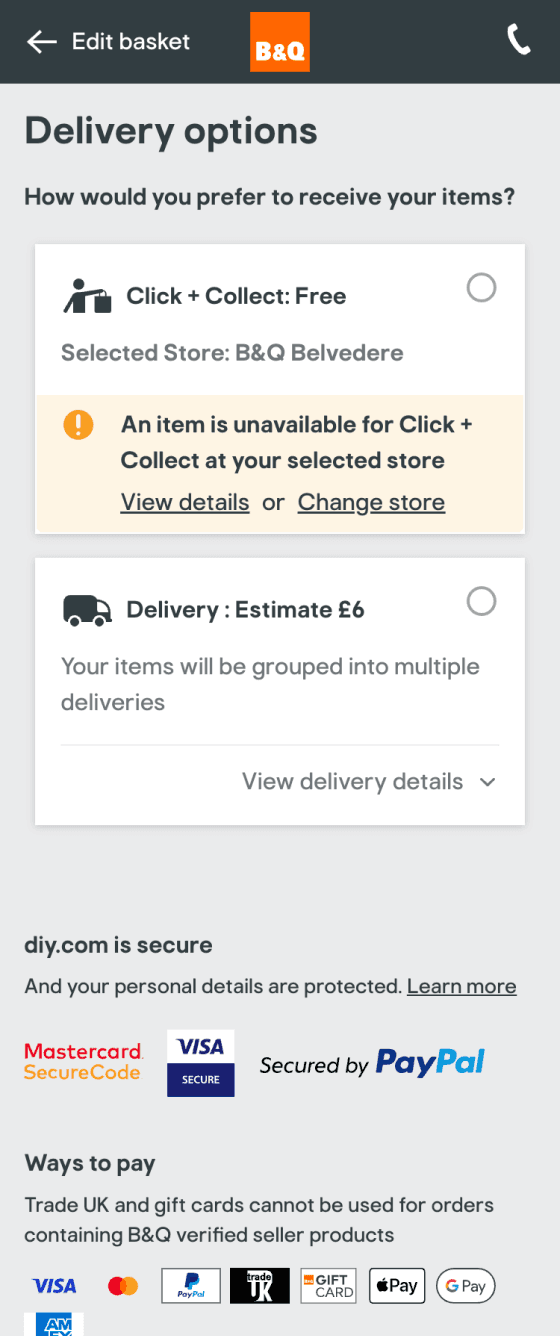
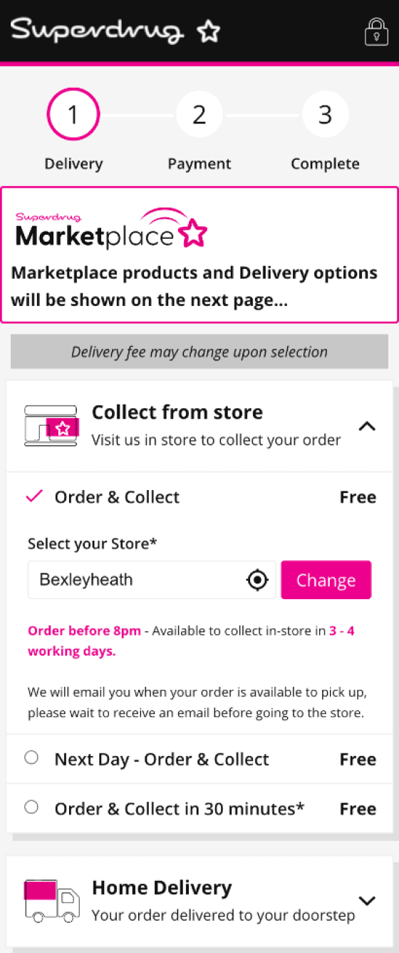
Fulfillment Limits: Third-party items did not support the popular Click & Collect service.
Time Constraints: The solution needed to be defined and delivered within a very tight timeline considering the scale of the project
How might we create a simple, seamless end-to-end user experience across multiple sellers, delivery options, and fulfilment journeys while meeting our three year business goals?
+10M
GMV
+200
New Sellers
+10000
New SKUs
user-centric validation
Experience Benchmarking
I reviewed 10+ competitors with similar marketplace models and identified consistent points of confusion across the journey. These included:
Unclear delivery signposting at the top of the funnel
Poor communication around split baskets
Fragmented checkout experiences when multiple shipment options were involved
3 key insights from testing
Unmoderated user testing using mid fidelity wireframes revealed the following insights
Brand Blindness: Users missed marketplace status until "split fulfillment" at checkout.
The Delivery Trap: Users expected a single £25 free delivery threshold, not per seller.
The Journey Confusion: Users struggled to distinguish "collection" vs. "delivery" for mixed items.

From Insights to Strategy
I synthesised findings from heuristics, data analysis, stakeholder input, competitor reviews, and user testing to uncover recurring patterns across the journey. Despite spanning different touchpoints, the same core issues consistently emerged:
lack of clarity, inconsistent communication, and exposure of backend complexity.
This showed that the problem was systemic across the entire transaction journey rather than isolated to a single stage, requiring a holistic approach. I translated these insights into four strategic focus areas aligned to key stages of the user journey.
Top of funnel: Improve delivery and fulfilment signposting early
Basket: Clarify split fulfilment and pricing logic
Checkout: Simplify decisions across delivery options
Post-purchase: Reinforce clarity and build trust through communication
goals overview

SOLUTION
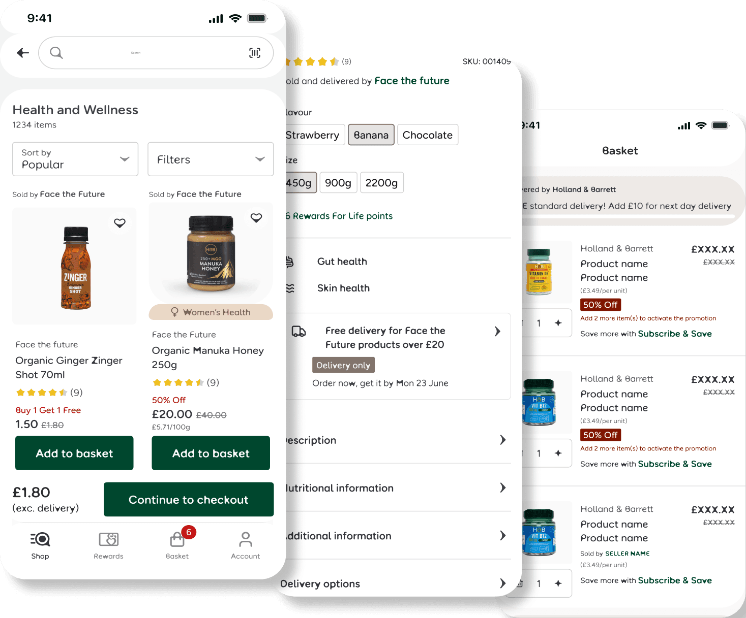
Phase 1: Creating a Visual Language (Clarity & Consistency)
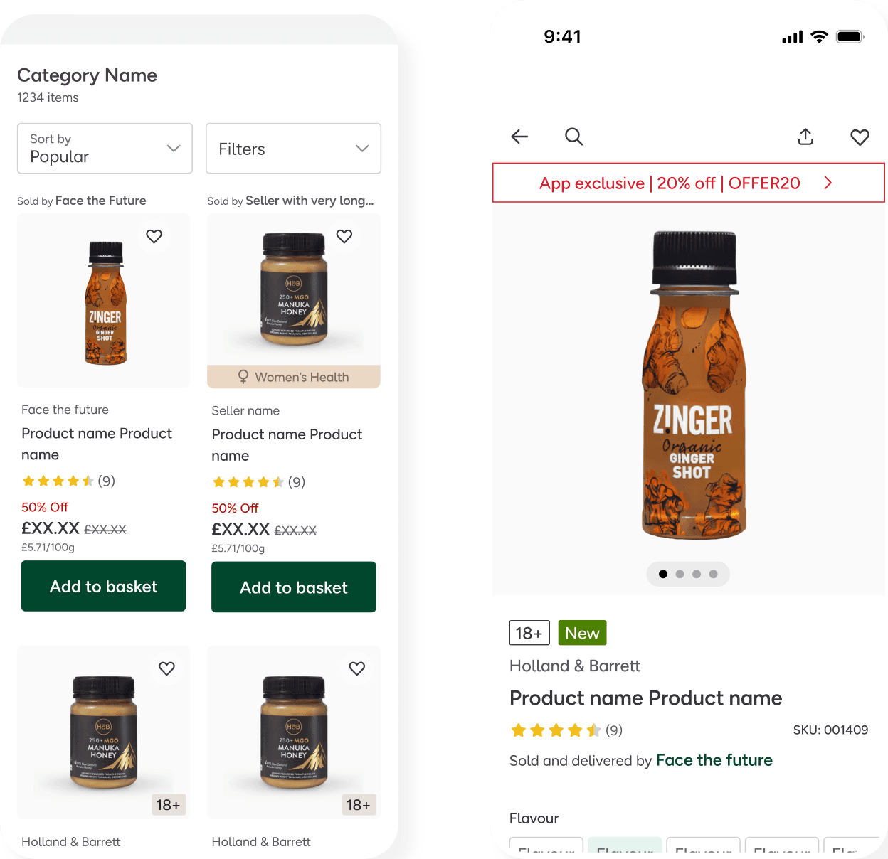
I started by designing a Universal Badge System.
The Struggle: Heavy icons cluttered the mobile UI.
The Pivot: Switched to a subtle, text-based "Sold & Delivered by" tag, improving accessibility and reducing visual noise.
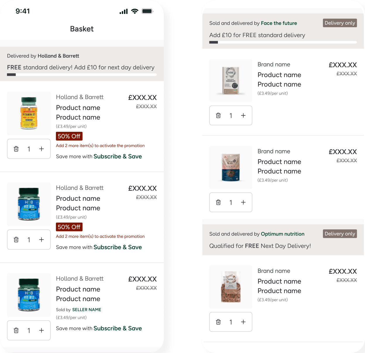
Phase 2: Solving the Basket Complexity
The most complex area was the Basket & Checkout. When a user has an H&B item (Click & Collect) and a Seller item (Home Delivery), the UI often breaks.
Decision: Implemented Grouped Seller Logic to visually box items by fulfiller.
Reasoning: Transparently justifies split delivery fees, turning "hidden costs" into a logical result of the user's choices.
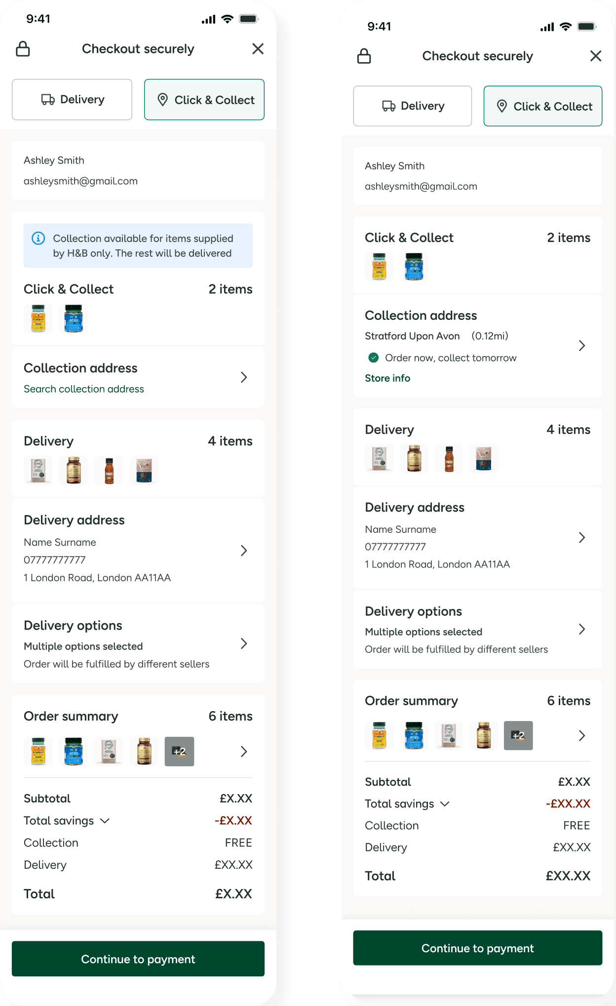
Phase3: The "Mixed Checkout"
Managing a single transaction containing both Click & Collect (H&B) and Home Delivery (Marketplace) items.
The Challenge: Unifying two separate engines into a "Multi-Stream" journey within a traditionally linear flow.
The Fix: Bridged legacy backend gaps with a UI that intuitively handles split-order fulfillment.
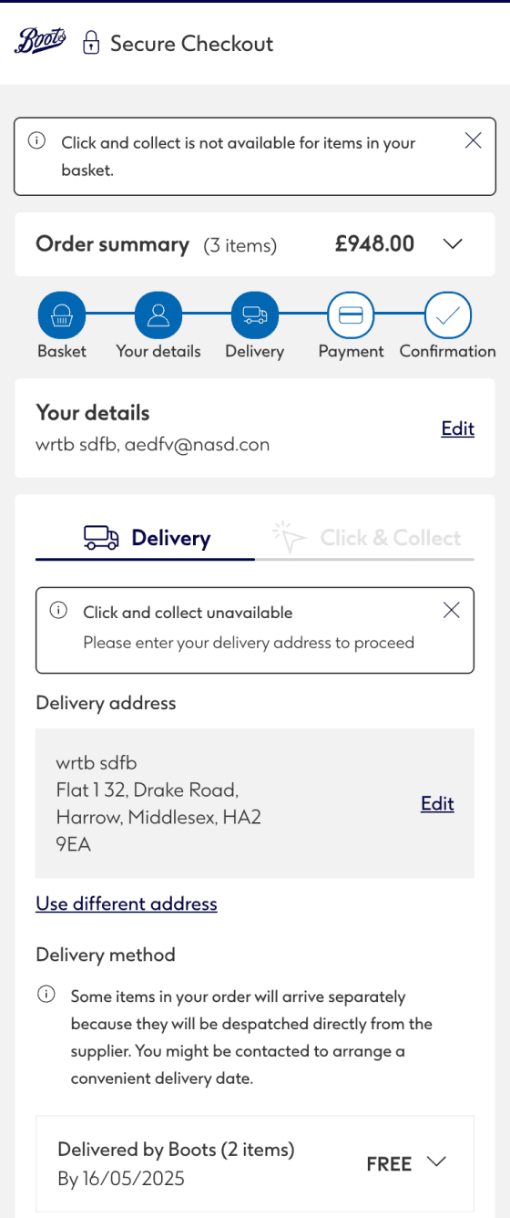
The Solution: Sequential Fulfillment
I introduced a staged flow to simplify the mental model:
Step 1: Confirm H&B collection point.
Step 2: "Unlock" the Seller’s shipping address section.
This created a seamless hybrid experience while maintaining technical separation between fulfillment streams.
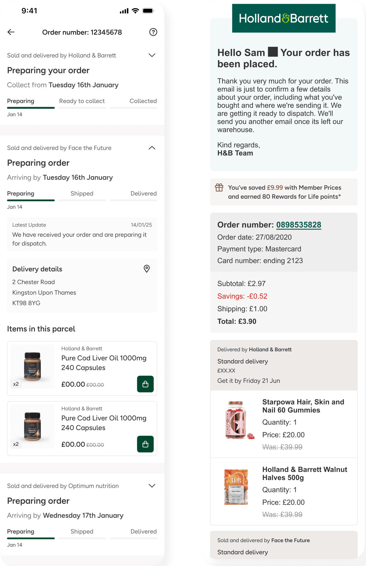
Phase 4: Post-Purchase Trust
Once the order is placed, the "H&B Brand Promise" is at its most vulnerable. If a user receives one item but not the other, they may think the order is lost.
The Shift: Moved from a "Simple List" to a status-based hierarchy for Order History and Emails.
The Logic: Applied accordions to group orders by status, hiding complexity while maintaining scannability.
PACKAGE 1 (H&B): "Ready for Collection at [Store Name]".
PACKAGE 2 (Seller): "Dispatched - Track with [Carrier]" for the Marketplace item.
Outcomes and Evolution
Collaborative impact and Reflections
As the Lead Designer, I acted as the "connective tissue" between several product squads (Search, PDP, P13n, and Checkout), each with competing KPIs. While the Search squad prioritized page load speeds, the Checkout squad focused strictly on conversion. To align these teams under a unified vision, I facilitated a series of cross-squad workshops and frequent stakeholder reviews. Navigating this was a high-pressure challenge, as I had to balance tight delivery deadlines with rigid technical constraints while ensuring the user experience was functional and beautiful.
Outcomes and lessons learned
The platform generated £1.16M in GMV in its first financial year, scaling to £3.1M in the following year, demonstrating strong commercial performance.
We successfully onboarded 1,845 SKUs and 100+ sellers, significantly expanding product availability and customer choice.
From a design perspective, the introduction of consistent interaction patterns improved usability and trust, while enabling scalable growth across categories.